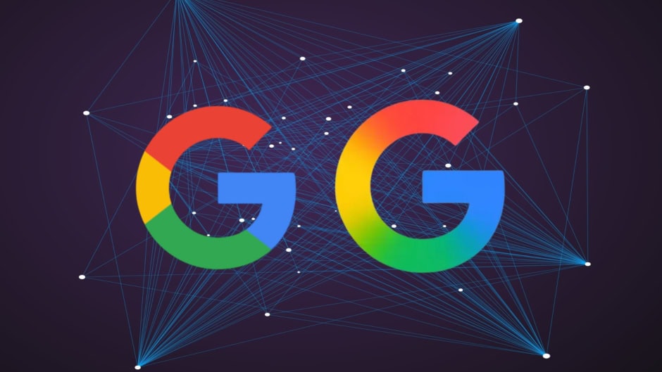
Google’s so-called “brand refresh” rolled out today, swapping its decade-old flat-color “G” icon for a nearly identical gradient version, because what says innovation better than blending the same four colors you already had, right?
Even though it does not seem like Google has put any thought behind the minimalistic change, experts have noted that there have been tweaks done to the iconic symbol since Google swapped its serif font for Product Sans in 2015. This latest facelift joins a lineage of Google logo evolutions, from the playful exclamation-packed early designs to the sleek, flat aesthetic of today.
What’s “New” in the Gradient
The update replaces the solid red, yellow, green, and blue quadrants with a subtle ombré effect. At small sizes, the change is virtually invisible, but hey, at least it matches the gradient vibe of Google’s AI assistant logo.
Where You’ll See the Update
Right now, only the Google app on iOS and Pixel phones sports the new look. Android users outside the beta program, web users, and anyone with a hint of brand familiarity will continue to see the original “G” until Google decides to lend them the upgrade.
Industry Reaction (Or Lack Thereof)
Fans on social media poked fun at the “major redesign,” dubbing it “Google’s boldest move since 2015.” Design blogs published thinkpieces wondering if gradients mark the next era of AI-driven branding. Meanwhile, the rest of us refreshed our screens twice to confirm nothing had actually changed.
Why It Matters (Sort Of)
Aligning the “G” logo with Google’s AI-themed visuals is meant to signal the company’s commitment to artificial intelligence. In practice, it’s a polite reminder that even tech giants need the occasional cosmetic facelift to stay “fresh.”