Google is rolling out a complete gradient redesign for Gmail and other Google Workspace apps, marking one of the most significant visual overhauls in the productivity suite’s history. According to sources familiar with the matter, all Google Workspace apps are getting a big overhaul with two overarching themes at play.
The gradient effect found in the Google G, Gemini, Home, Photos and Maps is present throughout to reflect the presence of AI-powered features. Google is addressing a major criticism of the previous icon set by making everything more distinct in terms of color and shape.
Four-Color Mandate Abandoned
Last generation’s mandate of including all four company colors in icons is clearly gone. The page container has also been removed for most apps to allow for larger, more unique icons. This represents a dramatic departure from the previous design philosophy that prioritized brand consistency over individual app recognition.
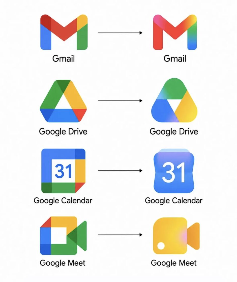
Gmail Returns to Red Dominance
The M envelope shape of the new Gmail icon is not too different from what exists today, though it is a little bit more rounded. Red is the predominant color with only a little bit of yellow, green and blue. This is the right call and makes the icon much more identifiable and unique. Of the new icons, Gmail is the only one with the four Google colors.
Google Drive Gets Bulbous Triangle
Drive no longer has red, just the classic green, yellow and blue that match the three editor apps. The exterior is a very rounded triangle that almost feels bulbous but has a sharp one at the center. The redesign makes Drive immediately recognizable while maintaining connection to Docs, Sheets and Slides.
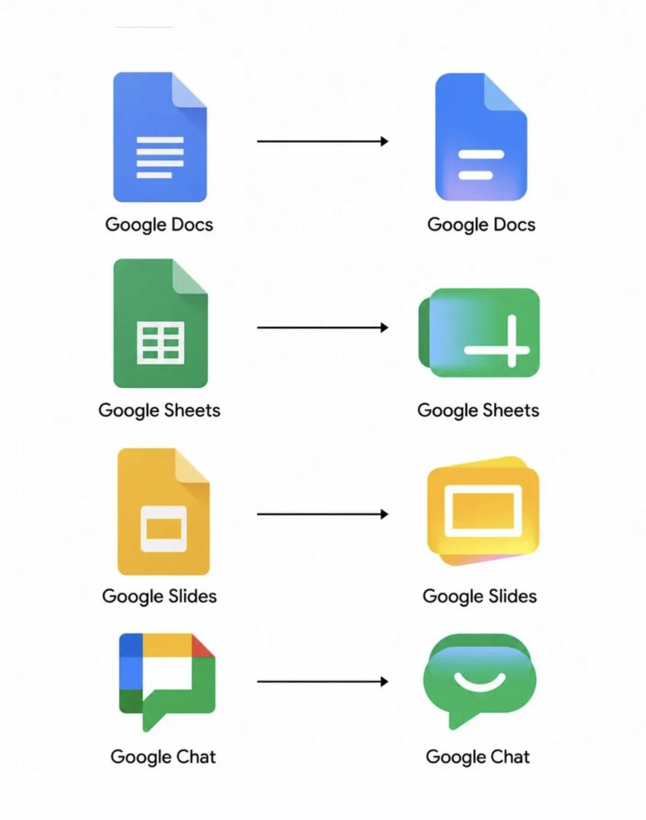
Editor Apps Switch to Landscape
Like before, Google’s editor apps each use a single predominant color. The Docs icon remains a vertical piece of paper but Sheets and Slides switch to landscape in a clever reflection of the actual apps. This represents a functional design choice that mirrors how users actually interact with spreadsheets and presentations.
Google Meet and Chat Get Major Overhauls
The video calling app sees a huge departure from the current design. It is still a video camera but yellow is the predominant color. Why Google chose that color is not very obvious. Google Chat sees the same overhaul with a pill-shaped message bubble that has a friendly smile. Green is presumably an homage to Hangouts.
Calendar Returns to Skeuomorphic Design
Calendar noticeably returns to the older icon design with a skeuomorphic reference to the flip-style object. The four-color exterior container is gone with classic blue returning. It is absolutely a throwback that older Google users will recognize from previous years.
Google Tasks Gets Button-Style Icon
There is still a checkmark for Tasks but the overall container is not very obvious. It could be a button that you tap when you have completed a reminder. Like Calendar, blue is the primary color. The design maintains functionality while achieving visual distinction from other workspace apps.
Google Keep Focuses on Light Bulb
Google has removed the page background to focus on the light bulb which has quite a bit of detail. The redesign emphasizes Keep’s role as an idea capture tool while making the icon more visually striking on home screens and app drawers.
Voice, Forms and Sites Get Updates
Voice retains the same shape as before but everything is more rounded. The phone reflects how the app is primarily for calling and business customers rather than consumers. Its use of light green matches Google Chat. Forms drops the paper motif for multiple choice bubbles though purple remains the main color. Sites switches from a dark blue to a lighter one with the horizontal switch reflecting desktop web.
AI Integration Drives Design Philosophy
The gradient design language reflects Google’s push toward AI integration across all Workspace products. The visual consistency with Gemini, Google’s flagship AI assistant, signals that artificial intelligence features will be deeply embedded throughout the productivity suite going forward.
The redesign addresses years of user complaints about icon confusion while maintaining enough visual cohesion to keep the Workspace family recognizable as a unified product suite. The removal of mandatory four-color schemes gives each app room to establish its own identity while the gradient treatment provides a modern AI-era aesthetic.