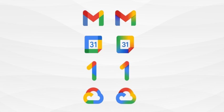
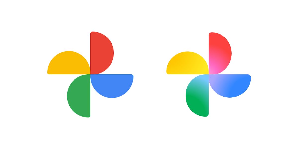
Google is steadily unifying the visual identity of its product suite, most recently updating the icons for Google Photos and Google Maps with a seamless, flowing gradient of its signature four brand colors. The change, observed in recent app builds and first reported by 9to5Google, is a key part of the company’s strategy to present a cohesive ecosystem of products for its “AI-first” era.
Fluid Aesthetic for the AI Era
The updated icons move away from rigid color blocks and toward a fluid, blended gradient aesthetic that was first introduced with the core Google “G” logo refresh earlier this year. The design blog confirmed that the “brighter four-color gradient ‘G’ icon” is intended to be a “company-wide mark.”
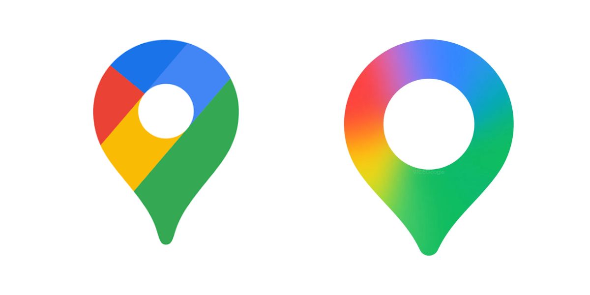
The Maps pin and the flower-shaped Photos icons are now appearing in test versions and preview forms with these blended hues. The visual change may go unnoticed by many users at first glance, but over time, it aims to reinforce the notion of Google as a single, seamlessly integrated platform.
Implications for the Google Ecosystem
The introduction of these gradients implies that other core Google icons, such as Gmail, Chrome, and Drive, are likely to adopt the treatment in stages, unifying the user experience across Android and iOS.
Developers will see a new standard for app branding that must be considered to maintain visual harmony. For users, the new aesthetic may subconsciously associate the gradient look with new, “next-gen” features and AI-enabled functionality that the company has heavily invested in.
Rollout & What to Watch Next
The gradient updates first appeared in beta builds and early versions of the Google app back in May 2025. With Maps and Photos now showing signs of the update, the rollout is clearly expanding across the broader product suite, though the staged deployment means a simultaneous worldwide switch-over is unlikely.
Key points to monitor include:
- Further Rollout: Whether Gmail, Chrome, Drive, and other major Google services fully adopt the new gradient theme.
- User Response: How users react to the gradual visual shifts, given early feedback ranged from indifference to mild surprise when the primary “G” icon changed.
- Third-Party Adoption: Whether third-party developers feel compelled to update their icons for visual harmony within the Android ecosystem.
- Feature Synchronization: Whether this design renewal coincides with major feature updates tied to Google’s AI and product integration strategy.
As Photos and Maps join the revamped icon family, Google is signaling that its identity, products, and services are evolving together, moving toward an era defined less by isolated apps and more by unified, AI-driven experiences.

