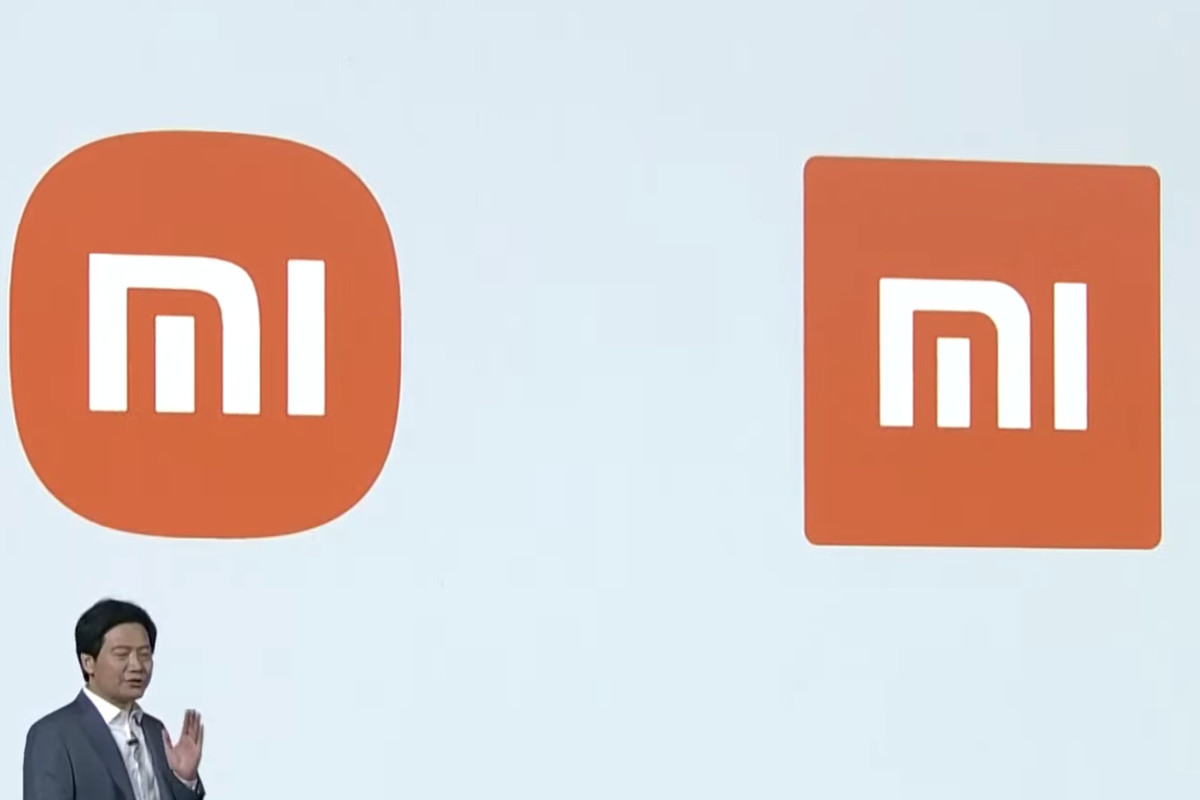
At Xiaomi’s two-day launch event, the Chinese-based smartphone company announced numerous products such as the Mi 11 series and the Mi Mix folding phone. However, the highlight reel was the new look of the company’s logo and identity.
One of Japan’s famous graphic designers Kenya Hara was behind the new look which followed a more minimalistic approach. According to Xiaomi, the logo brings more liveliness to the company itself.
The main changes are that the logo has rounded edges. The designer also added new MI typography which adds a more fresh yet pleasing look to the company’s name. The company highlighted it wanted the company logo to symbolize its agile nature while heading into the next decade.
Though the logo is sophisticated, however, what would truly matter to consumers is what kind of products would, later on, see the light of the day.
Capable of conversing in both Chinese and English, Tencent’s large language model ‘Hunyuan’ is claimed…
Working on multiple AI models, Apple has allocated several teams who are working on artificial…
The world's largest offshore wind turbine has achieved a milestone by setting a new record…
YouTube is stepping into the world of gaming. YouTube has started testing out its gaming…
In a remarkable academic achievement, Abdullah Zaman, a Pakistani student hailing from Attock, has clinched…
Flying Bum, the world's largest aircraft is ready to launch in 2026. The Airlander 10…
Leave a Comment