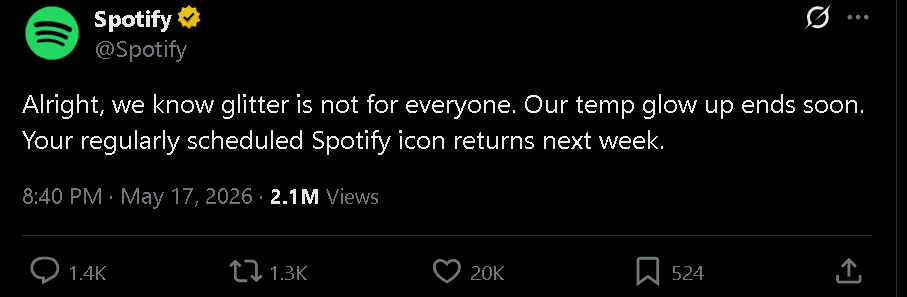
Spotify announced the company will retire its emerald-green disco ball app icon and restore regular logo next week following massive user backlash. The streaming platform introduced the mirror-ball-style logo as part of its 20th anniversary celebrations but backlash eventually reached unignorable peak leading company to reverse decision.
Spotify released statement acknowledging glitter is not for everyone stating temporary glow up ends soon. The company posted on X that regularly scheduled Spotify icon returns next week confirming disco ball design was always supposed to be temporary change for anniversary.
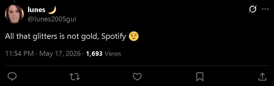
Users expressed strong negative reactions across social media platforms with one X user writing whoever designed this needs to be fired immediately.
One user directly responded as:
Comment
by
u/West_Explanation_509 from discussion
in
Music
Comment
by
u/West_Explanation_509 from discussion
in
Music
The new look marked first time streaming platform’s app icon had undergone temporary redesign in honor of milestone. The glitzy remix transformed iconic emblem into green disco ball while keeping three soundwave lines of original design rooted in brand’s origins.
Spotify tells media outlets the disco ball icon was always supposed to be temporary change for anniversary celebration. The company has not confirmed exact day or time regular logo will return to devices. During announcement period, some users claimed to have spotted that U-turn back to original appearance was already underway on their devices.
Alongside icon experiment, Spotify also launched limited-time feature called Party of the Year(s) showing users their entire listening history over platform’s 20-year existence. The feature remains available for six weeks only.
Reactions from users have been mixed to say least with anniversary makeover lasting just weeks before company confirmed retirement. Peace is soon to be restored, thanks to internet feedback.