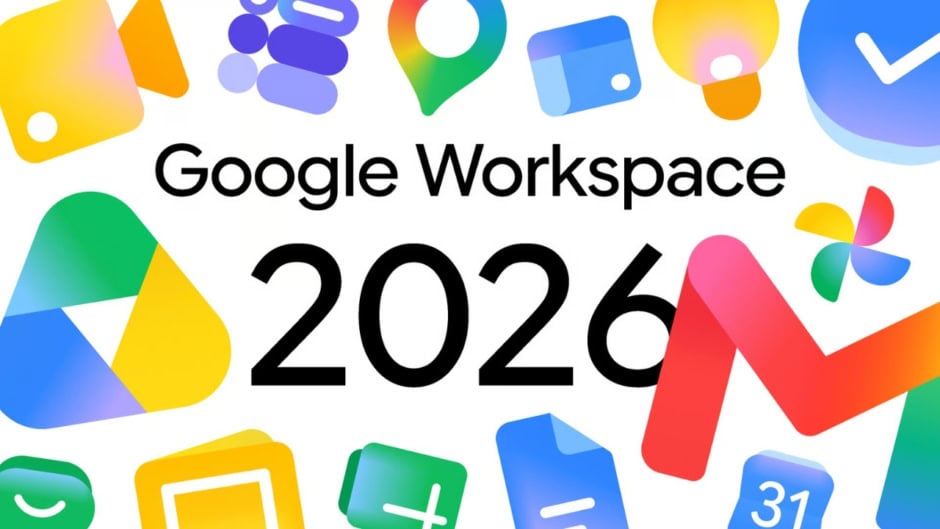
Google started rolling out redesigned gradient icons for Workspace apps including Gmail, Google Drive, Docs, Sheets, Calendar, and Meet just ahead of Google I/O 2026. The update drops Google’s strict four-color style for softer gradient look making apps more distinct and easier to identify at glance.
The redesigned icons are already visible in Google’s web app launcher and Chrome new tab page marking one of most significant visual shifts in productivity ecosystem in years. Google moved away from enforcing all four brand colors in every icon with each app now emphasizing dominant color supported by gradients rather than equal segmentation.
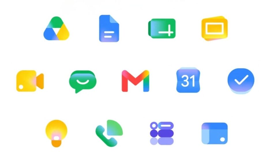
Gmail retains familiar envelope structure but now features smoother gradient shading instead of flat red tones making icon much more identifiable. Google Drive adopts cleaner triangular form with softened transitions between colors losing red entirely keeping only green, yellow, and blue matching three editor apps. Calendar shifts back to distinctly blue focus making it stand out immediately on busy screen.
Docs icon remains vertical piece of paper but Sheets and Slides switch to landscape in clever reflection of actual apps. The orientation shift provides shape-based shorthand helping users distinguish between spreadsheet and document without looking at color. Google Meet sees huge departure from current design with yellow as predominant color while Chat adopts pill-shaped message bubble in Hangouts-inspired green.
The gradient effect found in Google G, Gemini, Home, Photos, and Maps is present throughout reflecting presence of AI-powered features. Google addressed major criticism of previous icon set by making everything more distinct in terms of color and shape. Page container has been removed for most apps allowing for larger more unique icons.
Broader rollout across Workspace apps themselves expected during Google I/O week or shortly after according to industry observers.