Threads released an updated brand logo and font to solidify the platform’s presence and position for future growth.
The redesign aims to distinguish the app from Instagram and Meta’s other apps according to company Chief Connor Hayes. However, the new branding establishes Threads’ unique market position as an alternative conversation platform competing with X.
Hayes stated the team wants the brand to feel like the product built for conversation and always in motion. The redesign has been in the works over the past few months he revealed. Furthermore, the leaning italics of the new logo represent the forward-thinking energy of conversations on Threads.
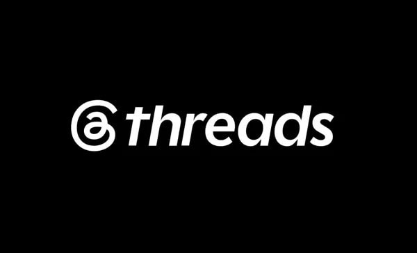
Designer Adam Clare stated it has been almost three years since Threads launched essentially as an Instagram side project. The update better reflects the brand and where it is headed toward a new standalone era. Consequently, the increased weight sets the logo apart from Instagram and helps it hold its own next to other app icons.
The logo is drawn in one continuous line reinforcing the hand-drawn elements Meta’s Twitter clone has leaned into previously. This signals that on Threads the conversation never stops according to Clare. Meanwhile, most users will not recognize specific details like this he acknowledged.
The branding will help establish the platform’s brand identity forming the foundation of a broader design refresh.
The platform currently has over 400 million monthly active users and aims to become a billion-user app. The platform rolled out the new logo as it continues to grow its user base and compete with X.