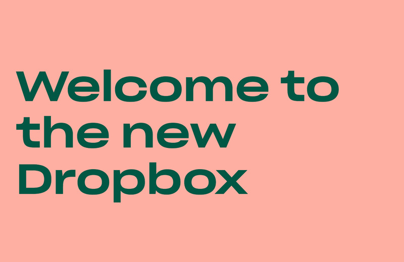
Dropbox is more vibrant than ever.
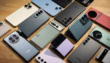
Dropbox has revamped its brand and has become vibrant with the inclusion of a lot more colors. This is the company’s first major redesign after 10 years. It now has a lot more colors unlike the previous white and blue box subdued hardly noticeable logo. The new logo is now flatter.
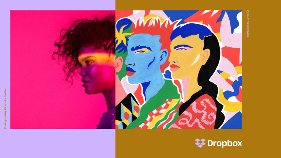
“As our mission has evolved from keeping files in sync to helping keep teams in sync, we realized our brand needs to change, too. Our new brand system shows that Dropbox isn’t just a place to store your files—it’s a living workspace that brings teams and ideas together. The look is expressive, with vibrant colors, rich imagery, a versatile typeface, and playful illustrations. We’re excited to share it with you.”
With its new design, Dropbox is hoping to stand out more among its competitors including Box, OneDrive and Google Drive. Moreover, the company thinks that the new colors will make its users more creative.
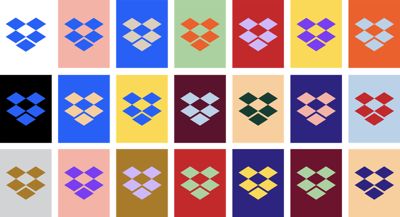
According to the company, the color of the new logo will change according to the situation but we are not sure what a “situation” could be in a file sharing service. Maybe it’ll get the colors from pictures.
“Our new system juxtaposes color pairs in bold, unexpected ways. Color is dynamic and playful—especially when it comes to the new logo, which can change based on the situation.”
Did you like the new Dropbox design?