
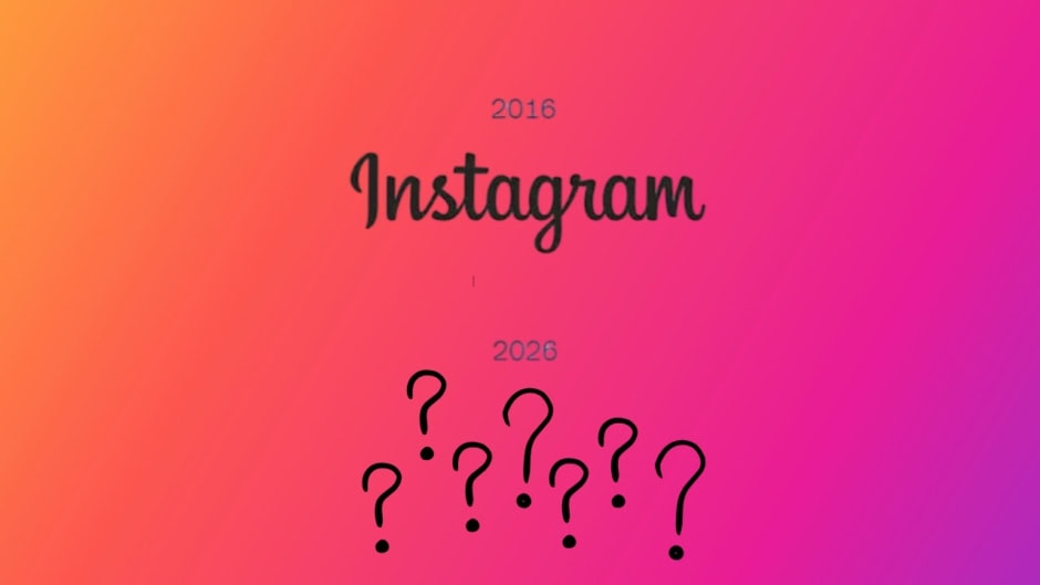
Instagram revealed its first logo redesign in more than a decade on August 13, replacing the wordmark that defined the app’s visual identity since its earliest years as a photo-sharing startup. Head of Instagram Adam Mosseri shared the updated branding on Threads, calling the previous wordmark “dated” and describing the refresh as “sharper and more modern” while still referencing the original design that users have recognized for over ten years.
The new wordmark introduces a completely revised typeface as part of what Meta’s design team calls a broader “brand system” overhaul across Instagram’s entire visual language. The refresh goes well beyond a simple font swap. It includes new typography, updated iconography, and revised formatting templates that will gradually roll out across the app, its marketing materials, and external brand assets. For now, the redesign changes the title at the top of the Instagram app. The camera icon on your home screen stays the same.
User reactions split sharply within hours of the announcement, generating over 5,000 combined replies across Mosseri’s Instagram and Threads posts before the conversation even peaked.
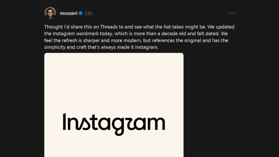
The loudest criticism targeted the stylized “r” in the new wordmark. Users said it looks nearly identical to a “z” because of the font’s angular treatment. “Instagzam” became a running joke across comment sections within minutes. Others ignored the typography debate entirely and used the comment section to voice deeper platform frustrations instead. They said they care far less about logo updates and far more about seeing posts from accounts they actually follow in their feeds.
Comment
by
u/nitropoison from discussion
in
mildlyinfuriating
Comment
by
u/nitropoison from discussion
in
mildlyinfuriating
That backlash pattern is predictable, and Instagram almost certainly anticipated it before Mosseri posted the announcement to his millions of followers. Every major platform redesign in social media history has triggered immediate negative reactions from users who resist visual change on principle. Facebook’s timeline redesign in 2011, Twitter’s rebrand to X in 2023, and Snapchat’s controversial redesign in 2018 all generated similar waves of outrage that eventually subsided as users adapted.
Major tech companies frequently pair branding refreshes with significant product changes underneath. They use the visual overhaul as an umbrella for deeper functional shifts that arrive weeks or months later. Mosseri did not announce any accompanying feature updates alongside the logo reveal. However, the scale of this brand system overhaul suggests Instagram may be positioning itself for a product update that the new identity was designed to introduce.
Meta published detailed documentation of the updated brand identity on its Design at Meta blog alongside the public announcement on Threads and Instagram.
As the blog puts it:
The refreshed Instagram wordmark is now rolling out globally, with the full brand identity following through 2026 and beyond. It’s all been created to flex and grow alongside Instagram and the people who make it a special place.
The new design system establishes visual language that could eventually influence how Instagram appears across Meta’s hardware ecosystem as well. Quest headsets and Ray-Ban Meta smart glasses already surface Instagram content through integrated apps, and a unified brand system would standardize that experience across screens, lenses, and spatial interfaces.