Before I jump onto what I like or dislike about the design, this by no means should be considered as a detailed critique of the Rozee revamp, but merely some initial thoughts from someone who has still a long way to go when it comes to UI/UX Design.
First, let me point out here that some of the general considerations a brand needs to undertake before going through a redesign. To me, a redesign is not just about a visual overhaul but more about the overall experience. During a design revamp, one might want to go back to the basics and ask some important questions:
- Who is your audience and what are their preferences?
- What are you trying to achieve with the revamp?
The relaunch of Rozee.pk left me a bit confused as to whether this was simply a brand refresh or a complete rebrand. Consider the analogy of brand refresh as a better haircut, new outfit and shoes (updated visual tone) whereas a rebrand as plastic surgery, a change in hair color or I might as well say, a change in identity – leading to re-purposing the brand’s persona amongst its users.
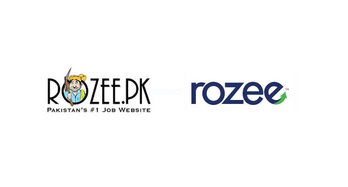
Rozee strikes me as a brand aimed at the job market in Pakistan and the old logo (Rozee baba) well resonated with the local audience. With the brand relaunch, I started wondering if Rozee now planned to tap into a much wider market other than Pakistan. Of course, all of these questions can’t be answered without taking into consideration the founder’s overall vision and direction for the brand. I won’t comment much on the actual visual style of Rozee relaunch but would briefly touch upon some areas from a user experience point of view.
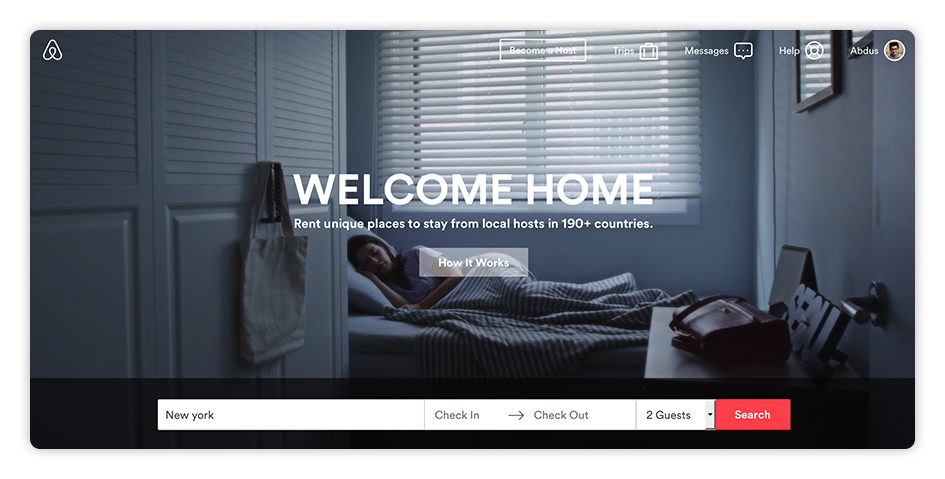
A landing screen is perhaps one of the most important pages, designed to accomplish conversion goals with specific user needs. Consider the following examples: Airbnb is perhaps one of my favorites, both in terms of visual design and the overall experience. The landing page immediately triggers an emotional connection with a well-defined copy. For someone completely new to the website, the service explains itself effortlessly – no complications.
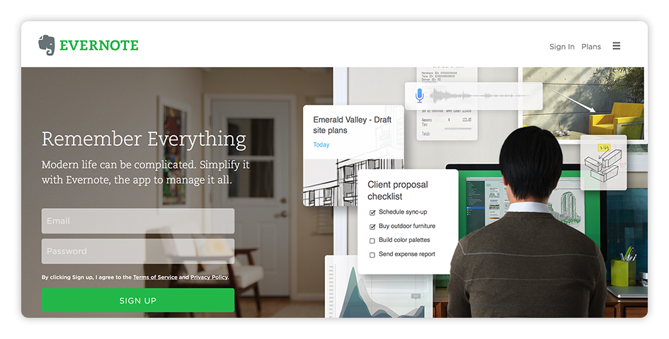
Evernote presents a yet another example of a good landing page. In two words, ‘Remember Everything’ with a secondary headline, the service describes exactly what it’s meant to do and how it would benefit a common user.
In the case of Rozee, whose primary audience is to target job seeking professionals, the website’s landing screen could have been much more informed. While I love how a user gets to search jobs with a search bar upfront, the tagline itself could be improved. I actually loved the previous tagline in use ‘Find the right job for you’. For any new user, it instantly prompted a call to action. The current tagline could have been used in conjunction with the previous tagline, adding to more credibility!
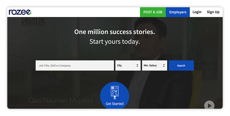
On the other hand, I think Rozee serves a decent job at laying out specific information targeted at employers, accessible through the ‘Employers’ tab at the top. The same could be coupled with a more persuasive tagline – something like ‘Start hiring the right candidate’.
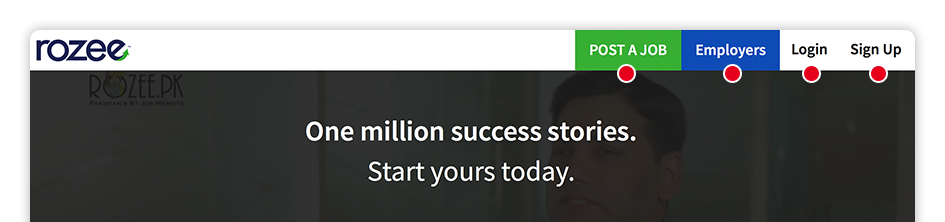
What concerned me, however, was the ambiguity between the navigation and login links at the top. Both the ‘Post a Job’ and ‘Employers’ link are directed towards the same audience – in this case, companies; but then, why would I need two entry points to perform the same action? Similarly, login and signup links towards the top right leave you wondering – are they directed towards professionals, or employers, or both? The rest of the homepage design boasts some great job listings with the ability to browse jobs by industry, city and company – good job on that.
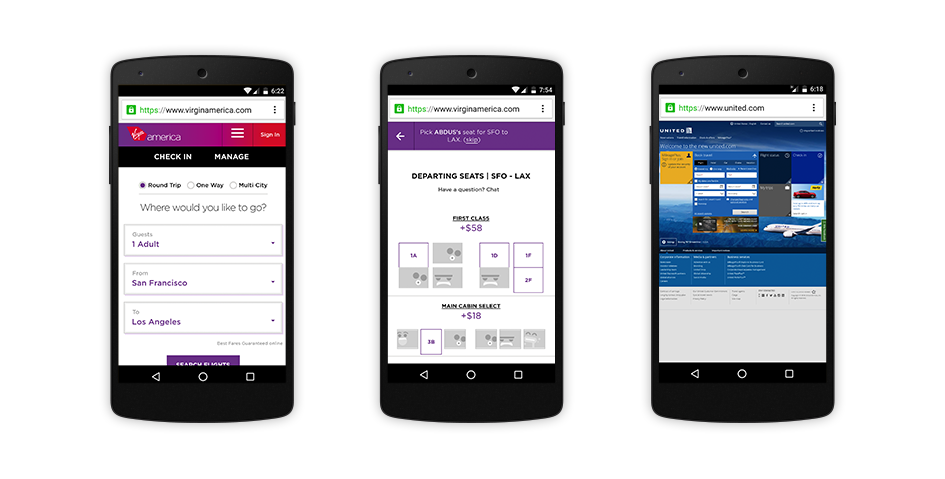
One of the most frustrating things I experience when browsing through a website is the amount of ‘fat’ I have to paddle through when trying to perform a specific action or not being able to get what I am looking for. Remember the last time you wanted to order your favorite headphones online and were presented with countless modal windows popping up asking you to subscribe to an email newsletter or ‘Like us on Facebook’ prompts before finally spotting the ‘Cart’ button and eventually realizing that the company wouldn’t even ship items to your country in the first place. That’s fat, leading to user frustration, and no amount of visual appeal would possibly make up for the lost experience. Try booking a flight through Virgin America on a mobile device and the same through United Airlines – no comparison!
A typical case scenario in this case would be a user trying to apply to a particular job but having to go through a gazillion steps to be able to apply or even find it in the first place. As far as the initial sign up process goes, I think with the revamped design, Rozee does attempt to address some areas in short, clear steps. Similarly, it works the same on mobile and although the drop-down and fields etc. could use some refining with the contrast and clunkiness, it does appear to serve the purpose, i.e., ‘Sign up users in order for them to start applying to jobs’. What does bug me, however, is the lack of visual consistency and experience throughout the website. A number of pages including the ‘Job Seeker Dashboard’ still follow the same old non-responsive design back from the days when I set up an account around 5 years back – a complete turn-off.
I also found a couple of inconsistencies with the way an applicant applies to certain jobs. Take the following case, for instance, an ‘Employers’ link is made available at the top bar for a job applicant, which by the way, shouldn’t be there in the first place in case you are an applicant; clicking on which you entirely lose the ability to go back to your ‘Dashboard’ and apply to jobs. Perhaps the only way is to click on the Rozee logo and start your search all over again. As an applicant, I saved (bookmarked) a number of jobs through the listings but had a hard time locating them through my Dashboard, ending up finding them towards the bottom of the page.
What I am trying to emphasize here is the fact that any specified action/goal for users on your website from Point A to Point B (in this case, applying for a particular job) should be incredibly simple and straight-forward, with minimum steps involved. One way of tackling the problem is running tests amongst users very early on in the stage and identifying all the pain points. Once the information architecture and an overall flow is figured out, it’s a lot easier to add visual elements to it.
Is this a complete refresh of the way applicants apply to jobs through Rozee? At this stage, I would say, no, but is it a step in the right direction? Yes! With mobile responsive elements being added to the site and working on some additional steps, it would be exciting to see what else Rozee has to offer. I assume part of the reason some of the interactions weren’t translated to an enhanced experience was the limitation of complex interactivity on mobile devices, but a stand-alone app should counter most of these problems.
As far as the logo revamp is concerned, the ‘e’ with the upward arrow does seem to signify a forward going approach synonymous with their tagline ‘Aagay Barho’, although I personally find it to be a bit of a cliché and would loved to have seen a touch of some visual element signifying a local feel. I would love to hear more thoughts from the design community. It’s refreshing to see companies in Pakistan finally embracing the value of design in their products. What’s missing, however, is the process that make up for the overall experience. Having said that, I feel Monis has a great team on his hands. With folks like Khurram Siddiqi by his side, he couldn’t have asked for anyone better. Excited on what’s more to come!