Microsoft has been teasing changes to the Microsoft Windows 10 user interface before it finally unveiled the new interface at its Build developers conference earlier this year. The completely revamped user interface which is being called the Fluid Design (Also known as Project Neon) will make its way to the Windows users with the Fall Creator’s Update set to be released later this year.
Although most of the changes just include minor additions which are either already rolling out or have yet to, the update is mainly designed towards Metro, the principles which define the design policy of company including in typography and graphics. The complete Fluid design will gradually be implemented over the course of time, with the Fall Creator’s Update carrying the first wave of major changes.
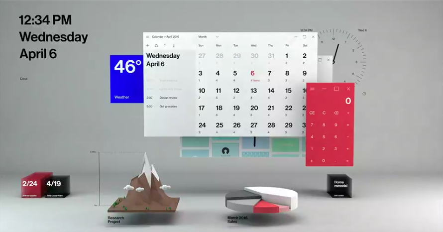
As evident from the introductory video, the new design has five key domain changes, Light, Depth, Motion, Material and Scale.
Light:
With this alteration, Microsoft plans to focus the area of windows in focus by giving it an illumination. Also known as Reveal, will illuminate where you’re gazing. Cursor would be used as a pointer and the illumination will hover around it. The feature, once pushed, would be available across the interface and in Taskbar and in Start menu. The feature will also be noticeable in some Windows applications including Windows Edge and Calculator. 
Image — Windows Central
Motion:
The feature will be used to interconnect the shift between different applications. The transitions would appear more connected and seamless.
Also Read:
- 5 Amazing Windows OS Tricks You Didn’t Know
- Microsoft’s Live Tiles are about to get a whole lot better
Depth:
Microsoft plans to add an additional z-axis to the user interface in this design. The feel of depth, hence possible, would be noticeable in effects like parallax effect. The parallax effects which essentially has been added to give motion relative to the content size on a page makes the large image on a page scroll slower than the smaller images. This feature will also give a sense fluidity to the interface and would be noticeable in image-centric applications like Photos and Store application. 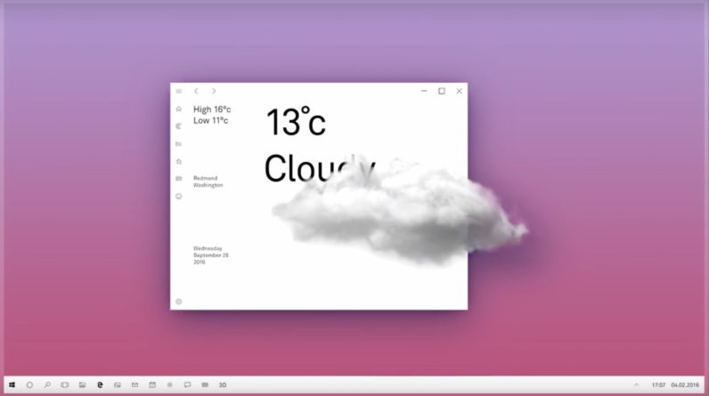
Image — TNW
Scale:
Lastly, Scale is the feature that would give an enhanced feel of interaction with the applications. It will change the way an application reshapes to different sizes and devices.
Material:
This is what would be responsible for manipulating the physical texture of the user interface. The highly semi-transparent texture will be used to blur out the background behind the current windows in focus. This feature has already been rolled out in the recent Preview builds and can be witnessed in many areas including the Start menu and Action Center. The Acrylic design will also come with the Windows applications including Calculator and Photos.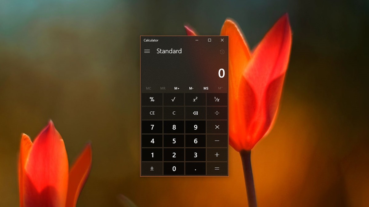
Image — Windows Central
The Microsoft’s Fluid Design can prove to be a game changer in the field o UI design for Microsoft Windows. The update was being anticipated by the critics after it was repeatedly teased by Microsoft. We, however, will still have to wait to see the design completed. A part of the design has already been pushed as an update with the Creator”s Update, while major changes are expected with the Fall Creator’s Update and the subsequent updates as well.
Featured Image — The Verge